Rooftop Weather Data: Temperature


source: http://metstation.uwec.edu/About.htm
Rooftop Weather Data: Wind


source: http://metstation.uwec.edu/About.htm
Regional Climograph Data (Worldclimate Website)
Acquired from the local weather station, the following data is useful for making conclusions about our local weather. Here, we can see the unusual temperatures we experienced this year.Overall, temperatures were much warmer than would be expected given historical trends. March, for example, was significantly warmer than usual. In years past, it has not been uncommon to experience significant snowfall and low temperatures in March, but this year we experienced temperatures in the 70s and no snowfall. This data was compared with the Eau Claire climograph (below).


source: http://metstation.uwec.edu/About.htm
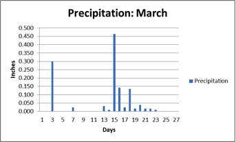
Rooftop Weather Data: Precipitation
In the following precipitation graphs, we can see that precipitation in the winter months was far below normal. According to all the climographs, the winter months usually experience the least amount of precipitation, but the precipitation received this year was drastically different from the historical trends. In the January bar graph below, we can see that precipitation in January of this year was roughly 10% of the norm. By historical standards, February was also rather dry.


source: http://metstation.uwec.edu/About.htm
Rooftop Weather Data: Wind
The wind pie charts below are also based upon the data records from the rooftop weather station. Here, we can see that the the predominant wind direction was from the west. However, the later months had a higher portion of east winds. Interestingly enough, more precipitation was also received during these months. This could be due to the fact that we have more warm, moist air coming from the maritime tropical air mass near the gulf coast.


source: http://metstation.uwec.edu/About.htm
Regional Climograph Data (Worldclimate Website)
Based upon 30 years of recorded air port temperatures, the climographs below allow us to compare this year's conditions to historical weather patterns.Climograph data was gathered for various locations to paint a broader picture of weather patterns in the region. These various data sources could also be used to weed out any anomalies in the local data.


Source: http://www.worldclimate.com/sources.htm#2300
NOAA Yearly Temperature History (12 month intervals)
With data from 1895 to 2012, the graph below provides convincing evidence for climate change. In the long run, we can see that there has been an increasing trend in yearly temperatures. In addition, we can see that this year is currently the warmest year on record.

Conclusions
Warm and Dry Winter
To compare this year's weather with previous years, we can examine both this year's rooftop data and the climiographs. With the temperature bars in the climographs, we can see that the winter months--January, February and March--are typically much colder than this year. For instance, the average temperature for January was roughly 23 degrees Fahrenheit, more than twice the historical average. In addition, this precipitation lines in the climographs indicate this winter was relatively dry in comparison to previous years.
The lack of snow certainly caused drought concerns for the summer months. Since snow melt is a gradual process, the water slowly percolates into the water table; rain, on the other hand, tends to exit watersheds more sporadically because precipitation intensity often quickly exceeds the infiltration capacity of the exposed landscape. Thus, we might have conditions where the water table is seasonally low.
Though it may be tempting to blame this year's conditions on climate change, the warm and balmy winter is most likely due to strange patterns in the jet stream. This year, the jet steam brought about an influx of warm air from the south west, contrary to the last year's inflow of cold arctic air. Apparently, this jet stream pattern can be attributed to an unusual pattern of the Southern Oscillation. In addition, La Nina conditions have decreased Pacific Ocean temperatures off the U.S. coast, which in turn, decreases evaporation rates and could partially explain the dry conditions. Finally, the low snowfall could also influence temperature conditions, as a bare landscape tends to absorb more solar radiation than a snow covered landscape.
Warm and Early Spring
Additionally, when compared with the climograph data, the rooftop data indicates that March temperatures were far warmer than in the past. For instance, the average temperature for March was roughly 48 degrees Fahrenheit, much warmer than the historical average of 30 degrees. In addition, March was also marked with days of exceptionally high temperatures (in some cases temperatures bordered 70 degrees). These unseasonably high temperatures contributed to an early spring bloom and actually raised concerns for those in the agricultural business. Many were concerned that a sporadic cold snap could produce frost that would effectively halt summer harvests--the harvests of apples, for example.
The wind pie charts also explain the precipitation patterns of March and April. As exhibited by the pie charts and the precipitation bar graphs, there is a correlation between southeast winds and precipitation. This is because this wind brings up warm, moist air from the maritime tropical air mass near the Gulf of Mexico. This warm air mass often collides with a cold air fronts associated with Alberta clippers. In the months of March and April, we experienced a number of mid-latitude cyclones, which brought precipitation.
Also, it is important to note the correlation between temperature and precipitation. In both the local rooftop data and climograph data, we can see that precipitation and temperature share a positive relationship. This is relationship is likely due to the fact that more convection occurs as the warm air masses collide with colder air masses. Further, warmer temperatures undoubtedly speed evaporation rates, thus increasing the speed at which water changes phases.
No comments:
Post a Comment